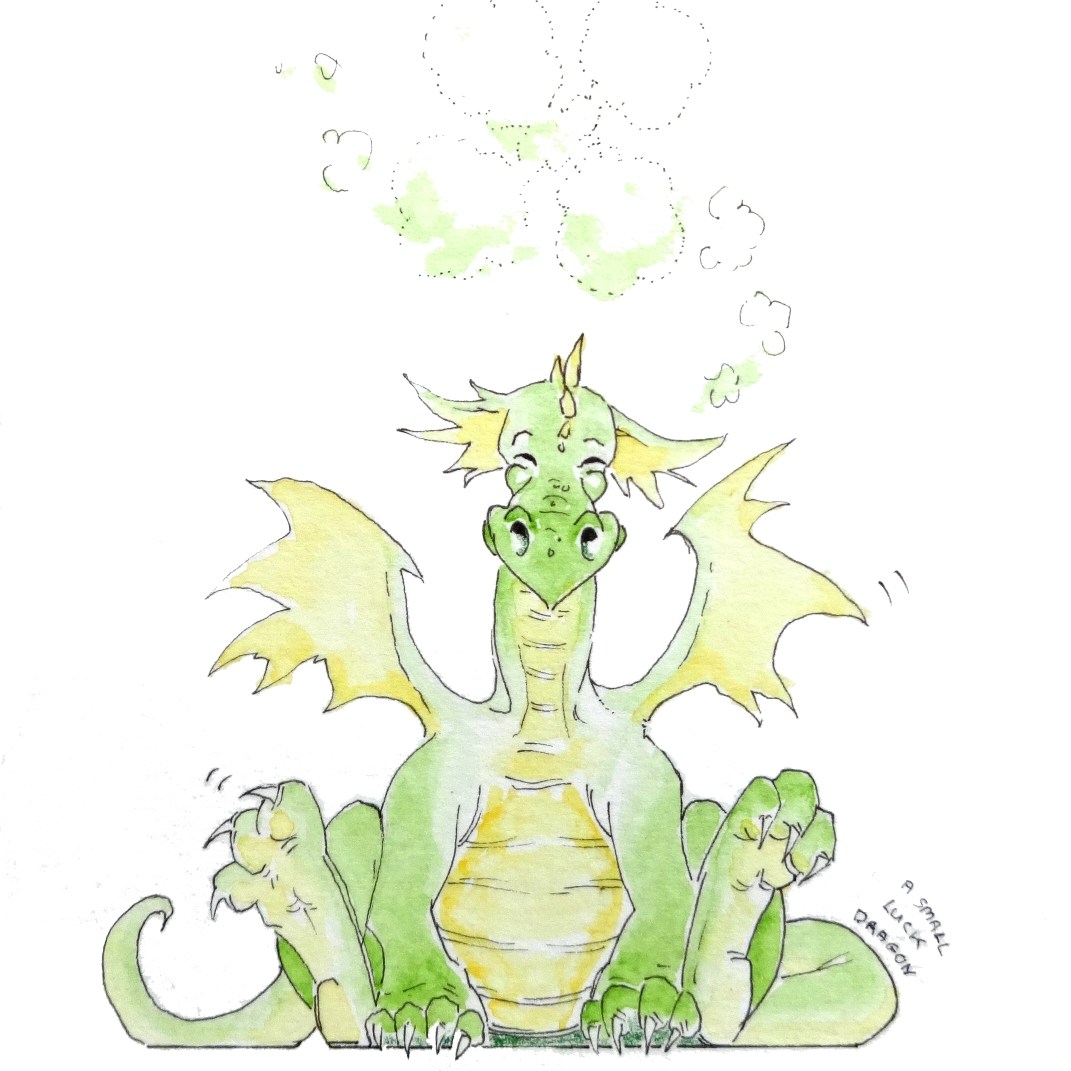
On my way to celebrate Easter with my family, in between checking how badly the chocolate Easter eggs had melted1 and conversations about bubonic plague2, I began a recounting of all the different weekend workshops I’d been on in spring. It turns out there were quite a few…
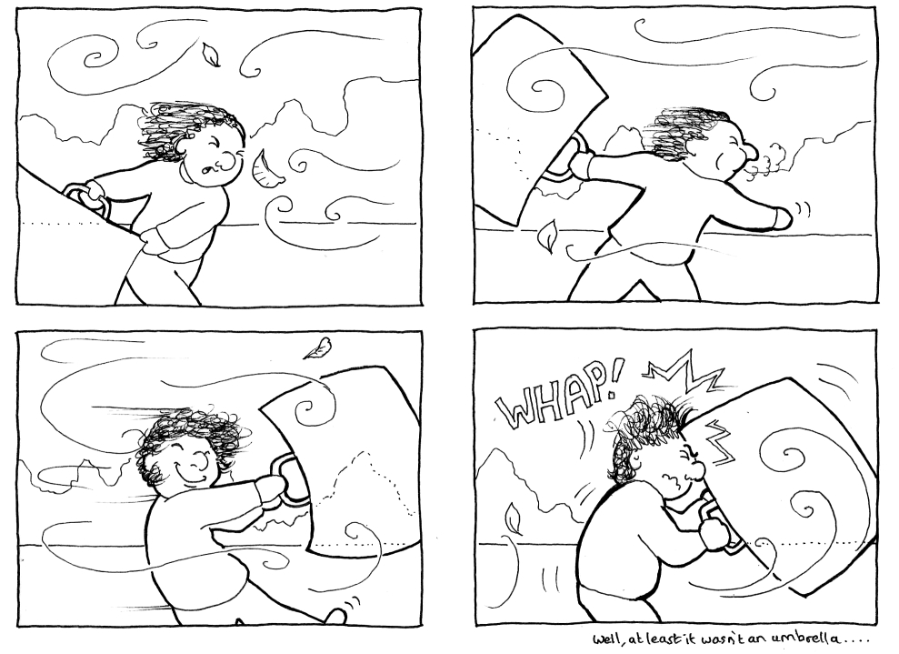
Windy workshop
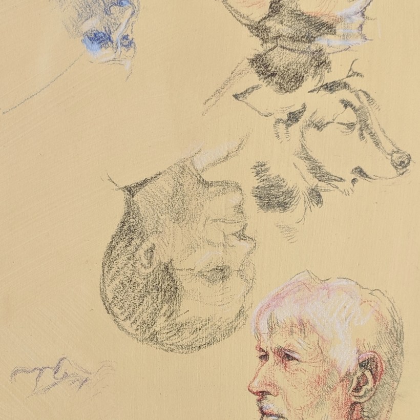
I made great efforts to attend my first Chertsey Artists lifedrawing session of the season:
I chose a green background colour, the same as the one used for this lifedrawing, but it wasn’t quite as successful this time round; the previous attempt’s darker, more reflective-skinned model and directional orange lighting just look more dramatic.
I also managed to use too many colours in the drawing (as usual); perhaps next time I’ll pick a paper colour and a few pastels in advance of the session, and stick to them. Mind you, I say that every time…
Portrait of transport woe
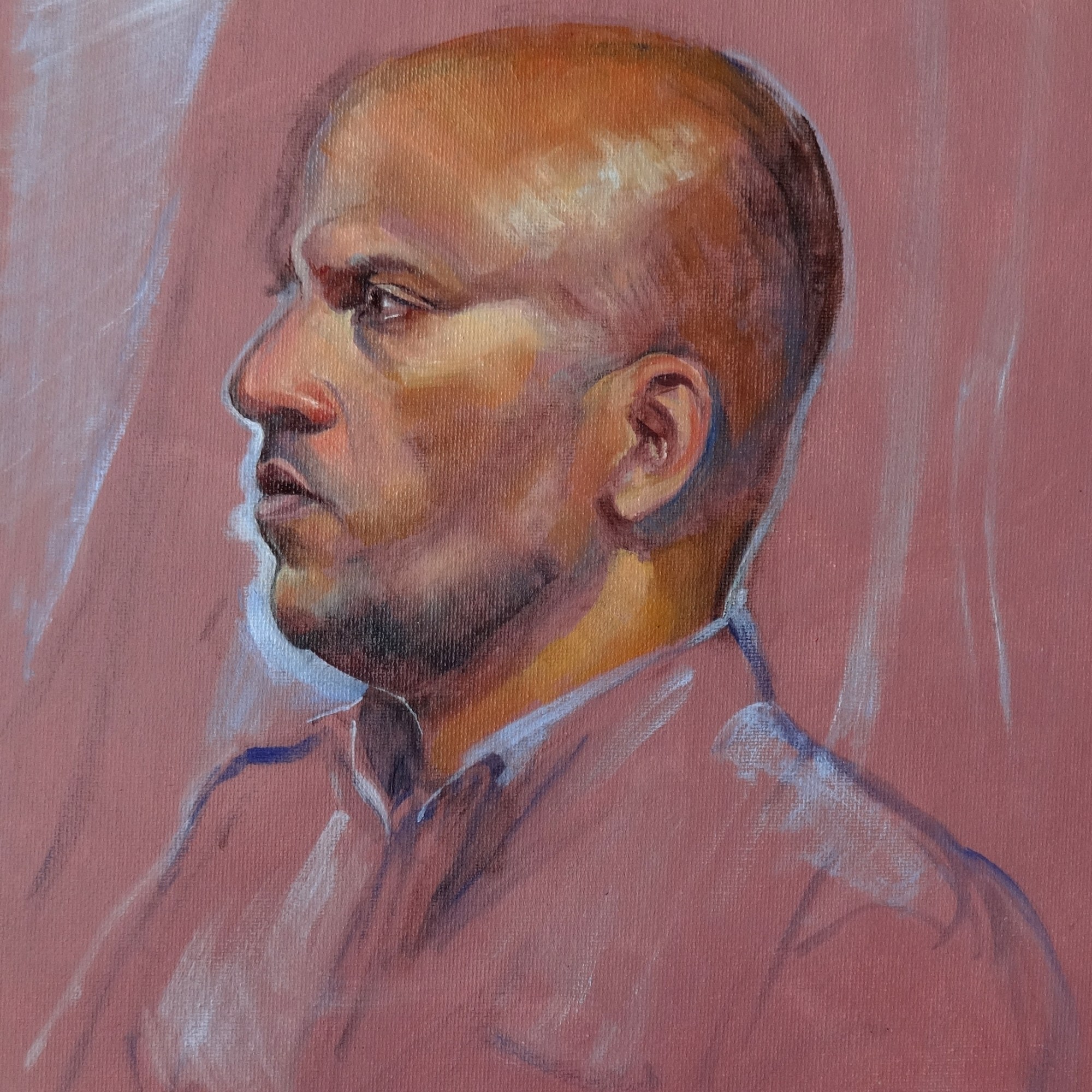
Following the lifedrawing session, the next weekend I’d booked into a portrait class, again in Chertsey.
Now, I had a plan in mind for this portrait – in fact I’d been on at the tutor to tell me when this particular model was attending, and I would go to THAT session with THIS COLOUR board4 and THESE oil pastels, come what may…
Fortunately the gale-force winds had gone down by the time of the portrait class. Less fortunately, so had the trains, extending a 2-something hour journey to 3.5, partly via replacement bus.

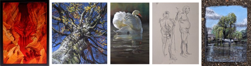
However, once I had straggled in and sufficient coffee had been imbibed to combat sleep-deprivation, it was a very relaxing, enjoyable session… the results of which are shown below (and many thanks to the other attendees for letting me post a photo of their work!)

Guess which one is mine… (hint: the title is ‘Feeling Blue’)
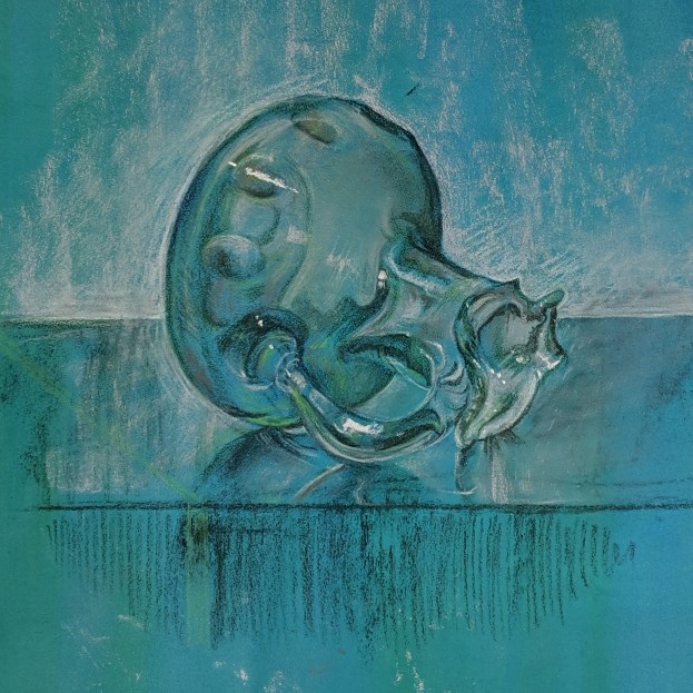
Water water everywhere
OK, I lied – this one wasn’t on the weekend at all.
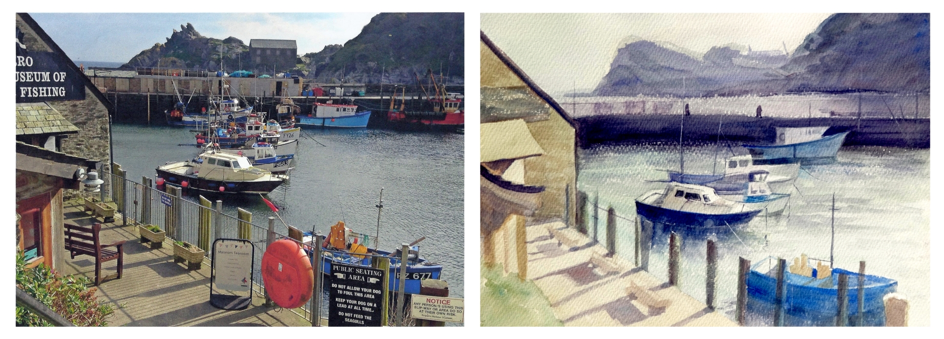
However, I was determined to be there, because one of my very favourite HAC artists, Sarah Poppleton, was giving tips on how to paint water…

Look. Loook. Loooooooooook…
Thanks also go to Sarah for letting me use a photo of herself and her artwork ^^.
One key point of the workshop was that drawing from observation was absolutely vital, which is a pity since I’m terrible at organising myself enough to go out and sketch from life – but there were still a couple of very useful tips for portraying water:
-
- In reflections, dark objects will be less dark; light/bright objects will be less light/bright… overall, the contrast will be diminished compared to the original image being reflected.
- The angle shown in a reflection may not be exactly the same as the angle you see the original image from – particularly true the closer you are to the image (and its reflection).
- Sometimes you can see through the surface of the water to things beneath its surface. The further away you are from the water you’re observing, the greater the angle light has reflected through to reach your eyes, and the less it penetrates through the water’s surface… so there tends to be a gradation away from seeing through the water to seeing only reflections, the further the water is from the observer.
- As a general point of atmospheric perspective (not just the case with water): darker, warmer colours tend to be in the foreground, and bluer, cooler one further away.
- Sparkling water – pure white paint looks unconvincing; using a few different pale, warm colours, with only a very few dots of pure white, looks much better. Additionally, using a warm underpainting colour for the sparkles will really make them shine in the finished image.
- Ruffled water scatters light more than a smooth surface, so reflections are much less perfect and often duller.
- Waves – look for lines of movement (i.e. where the waves are rolling from and to) so the overall pattern makes sense.