Berkhamsted Art Exhibition

Just a quick post to plug the local Berkhamsted Art Society Exhibition1, which is running until 5pm this Saturday (18th May2). It is a beautiful exhibition of local artists held in Berkhamsted Civic Centre, open daily from 9am to 5pm.

I was very surprised during my stewarding slot to discover how few visitors the exhibition was getting – considering the attractive venue, the location bang in the centre of Berkhamsted (barely ten minutes walk3 from the nearest railway station), the free tea, coffee and biscuits on offer, and of course the quality of the artwork on display4.

So – do please come and have a look if you’re in the area over the next few days!

190516 Berkhamsted Map


1
Or, as I have affectionately heard it phrased, Berko.

2
And not in fact the 8th of May, which was the date I so cunningly wrote on some blameless visitor’s receipt today…

3
Or – as I discovered dashing for the train home – 4.5 minutes flat-out running with a heavy backpack.

4
Not just mine ;p.

Springtime Sketching (interlude)

… and what has the mouse to do with springtime?

Not a lot1. It just happened to be drawn in the spring, as part of a couple of postcard designs to go to Bricket Wood Art Club2).

Anyway, more seasonal pastel studies are below, with only minor photoshopping3, for your delectation and delight – or at least a distraction until I get organised enough to do a proper post4.

All spring sketches small

Alas, the glorious candyfloss blossoms are now mostly over – but at least I drew some of them this year…


1
Unless you count the tendency of rats to frequent our garden in pursuit of food put out for the young birds.

2
…which has recently suffered a very sad loss. I should probably not go into details here, but will ask whether a general announcement should go up on the website at some point.

3
Memo to self – download Gimp from Gimp.org. I like trusty Paint.net, but I could do with more functionality (and better auto-levelling algorithms >_<).

4
Best estimate: around midsummer at the current rate!

Springtime Sketching (Part 1)

On my way to celebrate Easter with my family, in between checking how badly the chocolate Easter eggs had melted1 and conversations about bubonic plague2, I began a recounting of all the different weekend workshops I’d been on in spring. It turns out there were quite a few…

Windy workshop

I made great efforts to attend my first Chertsey Artists lifedrawing session of the season:
WindyWorkshop

I chose a green background colour, the same as the one used for this lifedrawing, but it wasn’t quite as successful this time round; the previous attempt’s darker, more reflective-skinned model and directional orange lighting just look more dramatic.190424 The extended limited palette

I also managed to use too many colours in the drawing (as usual); perhaps next time I’ll pick a paper colour and a few pastels in advance of the session, and stick to them. Mind you, I say that every time…

Portrait of transport woe

Following the lifedrawing session, the next weekend I’d booked into a portrait class, again in Chertsey.

Now, I had a plan in mind for this portrait – in fact I’d been on at the tutor to tell me when this particular model was attending, and I would go to THAT session with THIS COLOUR board4 and THESE oil pastels, come what may…

Fortunately the gale-force winds had gone down by the time of the portrait class. Less fortunately, so had the trains, extending a 2-something hour journey to 3.5, partly via replacement bus.
ReplacementBus

However, once I had straggled in and sufficient coffee had been imbibed to combat  sleep-deprivation, it was a very relaxing, enjoyable session… the results of which are shown below (and many thanks to the other attendees for letting me post a photo of their work!)

Full Workshop

Guess which one is mine… (hint: the title is ‘Feeling Blue’)

Water water everywhere

OK, I lied – this one wasn’t on the weekend at all.
However, I was determined to be there, because one of my very favourite HAC artists, Sarah Poppleton, was giving tips on how to paint water…

SMALL workshop picture

Look. Loook. Loooooooooook…

Thanks also go to Sarah for letting me use a photo of herself and her artwork ^^.

One key point of the workshop was that drawing from observation was absolutely vital, which is a pity since I’m terrible at organising myself enough to go out and sketch from life – but there were still a couple of very useful tips for portraying water:

    • In reflections, dark objects will be less dark; light/bright objects will be less light/bright… overall, the contrast will be diminished compared to the original image being reflected.
    • The angle shown in a reflection may not be exactly the same as the angle you see the original image from – particularly true the closer you are to the image (and its reflection).
    • Sometimes you can see through the surface of the water to things beneath its surface. The further away you are from the water you’re observing, the greater the angle light has reflected through to reach your eyes, and the less it penetrates through the water’s surface… so there tends to be a gradation away from seeing through the water to seeing only reflections, the further the water is from the observer.
    • As a general point of atmospheric perspective (not just the case with water): darker, warmer colours tend to be in the foreground, and bluer, cooler one further away.
    • Sparkling water – pure white paint looks unconvincing; using a few different pale, warm colours, with only a very few dots of pure white, looks much better. Additionally, using a warm underpainting colour for the sparkles will really make them shine in the finished image.
    • Ruffled water scatters light more than a smooth surface, so reflections are much less perfect and often duller.
    • Waves – look for lines of movement (i.e. where the waves are rolling from and to) so the overall pattern makes sense.

1
In a break from tradition, the bank holiday weather was in fact seasonably clement.

2
Don’t ask.

3
If by ‘great efforts’ one means ‘being up and about before 10am’ and ‘walking through a moderate breeze with an art folder’.

4
In fact the blue background was created by mixing blue acrylic paint and pumice, alá the mountboard pastel grounds in this post.

February Update (part 2)

So, I asked my partner to look at my website and tell me what my posts needed. He looked. He pondered. He wracked his brains. And the answer was… clickable footnotes1. I should probably gen up on my html anyway, since I’ve apparently volunteered to take on Bricket Wood Art Club website. In addition to helping out with St Albans Art Society website and Treasurey stuff. Hmm. Well, I’m sure that was sensible and I will in no way end up overloaded.

Anyway, on with the update:

Pastel grounds.
In light of the expense of Pastelmat and other addictively velvety papers, which eat through pastels and money with equal gusto, a fellow artist from St Albans invited me to experiment with creating new and exciting DIY pastel grounds2. In between cups of coffee, we employed a washing-up sponge and some gimungous interior decoration paintbrushes to apply:

    • Roughly equal parts cheapo acrylic paint, white acrylic gesso and ground pumice to pale-coloured mountboard (no idea what grade the pumice it was but it looked very fine to me)3.
    • Liquitex clear gesso to black and red mountboard (memo to self: next time *don’t* slather it on by the bucketload; velvety surfaces are good for pastels; small mountains of paint, less so).

I’d like to give the DIY grounds a mark-out-of-ten, but… I haven’t actually started applying pastel to them yet. Give me another year and I may get round to it… Anyway, in addition to providing all the mountboard and Liquitex, my friend also loaned me a rather spiffy white seashell for my next still life, as shown below (mainly because it’s more interesting than posting images of blank mountboard):

ShellFIN

Pretty in Pink (2019)
Pastel & coloured pencil
18 x 23cm

Card designs
The end of February (yes, OK, I know it’s mid-March already) signals the end of the usual slew of Christmas/New Year/why-is-everyone-born-between-November-and-February-birthday cards and, this year, some sadder things.

Slightlymassivecardbanner3

Keith Hornblower’s workshop
St Albans Art Society ran this workshop on 23rd February. I love Keith’s work, and so jumped on the bandwagon even though watercolour boat-themed landscapes are… quite far out of my comfort zone. However, despite a rocky beginning, and taking forever to complete my painting as usual, I very much enjoyed the workshop and (goodness!) am even moderately pleased with the result. Points of note:

    • A big thank you to the lady who kindly gave me her photo (shown below next to the final painting) to work from, without which I would have been a bit stuck. Next time I will bring my own reference material JUST IN CASE4.
    • Also grateful to Keith’s suggestion about moving the middle boat to improve the composition. And the fact that he never changes the water he washes his brushes in either. Hah! I feel so vindicated…
    • Of course, all of my watercolour tubes have dried up. Again. I don’t generally consider this a problem because watercolours remain soluble5. However, since I was using a very large paintbrush and tiny, dried-up pigment containers, I couldn’t get very strong darks – hence the lack of contrast in the painting below. Oops…

FIN Keith Workshop

Chris Christoforou’s talk on ‘How to Sell Your Work’
I’m glad I made it to this one… quite apart from being entertaining, there was a lot of advice I’d not heard before in the mix, particularly geared towards trying to arrange and physically show your work, and then make a living off it.

    • Firstly, he advised specialising your style and subjects to a few key areas – because if you’re too diverse you won’t easily become known as a go-to person for a certain type of work.
    • Conversely, the range of products you offer – framed work, small sketches, greetings cards, prints and paraphenalia such as T-shirts (good advertising) – should be as wide as you can make it to try and cater to as broad a range of wallets as possible.
    • He also commented that – if you’re aiming to live off your art – you ultimately have to price your work against for the total overhead of ‘time spent living at home’ until the picture is complete. Good point. I’ve been charging sub-minimum hourly wage for the time directly spent painting my pictures because… it’s hard enough getting that to sell. But how much does one spend over a 12-month period? For a painting that takes a month to complete, it needs to sell for over £1,000 for most artists just to break even6.
    • So, if you’re making a living on your art, tailoring your subjects to wealthy clients7 with oodles of disposable income is a good idea. Suggestions included birds of prey, dogs, koi carp; exotic big cats; potentially portraits, maybe even flowers… music to my ears. However, getting good source photos for some of these without violating copyright can be tricky.
    • The next step is finding an event – country fairs can be a good – that might both a) show your work and b) contain lots of wealthy clients.

One of Chris’s comments – after a couple of throwaway lines about nearly getting eaten by some of the big cats he paints in a few of the catalogue of exotic countries he’s exhibited in over the years – was that we should aim to sell ourselves as much as our artwork, because artists are never boring. And there I was, thinking to myself about how I can’t drive, never fly; how I spend half my time baking8 and watching DVDs, and the other half asleep.

Ah well, we can’t all be eaten by big cats…

LIONS


1
Ta-dah!

2
May be less exciting than advertised.

3
In my role as experienced hypochondriac I actually went and looked up how hazardous pumice dust. Not very, apparently, although inhaling the dust is still a bad idea.

4
The tutor accidentally prepares for the wrong workshop and has no reference material to hand out. Not that this would ever happen, right?

5
Unlike my poor neglected tubs of student-grade acrylics which are slowly dying off one by one. Or perhaps that should read ‘drying off’.

6
Assuming roughly £12,000 yearly expenditure. And in my case, how much of that yearly expenditure is spent on desserts from the Pudding Stop? I shudder to think…

7
Apparently judging by one’s shoes is a good way to tell. Although – I’m not 100% sure I’d be able to identify a designer shoe, given my own choice of footware…

SHOES

8
Mmmm… sticky toffee pudding…

February update (part 1)

All right, yes, it’s March. But only just!1

To prove I’d not only learned nothing from my previous mass-framing escapades, but also had the capacity for new and exciting blunders, this month I had to co-ordinate (within a four-day period):

1)    Picking up unsold work from the Pastel Society2 in London.
2)    Ordering the frame for, picking up, framing, and safely posting a commission *bites nails*3.
3)    Ordering (from a separate place) a frame and mount – and then framing and delivering – two pictures to a local art exhibition courtesy of Bricket Wood Art Club.
4)    Attending an all-day workshop of St Albans Art Society’s by Keith Hornblower… more on this later. It was brilliant, but the workshop – and evening visitors – meant I clearly wasn’t going to get any of #1 to #3 done this day.

So. First issue. There wasn’t a lot of time left before I needed to post #2 (the commission), since it was a birthday present. In fact there was so little time I ultimately had to manage both #1 (collect pastelsoc work) and #2 (collect commission frame) on the same day. Logic dictated that I:

    • Zip to London in the morning to pick up the pastel soc work4.
    • Dump the pastel soc work at home.
    • Zip out again and collect the commission frame before the shop (Artscape in Harpenden) shut for the day at 5:30pm.

A good plan? Why yes. Except I overslept and had no time for step 2. My arms were pretty tired by the end of that day. And of course, due to the cunning location of Artscape (which keeps getting shifted further away from the Town Centre)…

Comic v2 FIN

…it made my arms feel even tireder.

To add insult to injury, I then had to run5 for the train on the way home (with three frames in my folder). Fortunately the running was all downhill. Less fortunately it was muddy. More fortunately again, I did not end up tobogganing downhill on the frames.

Second issue. Yet again, I did not factor in enough slippage time when ordering the frames for #3 (the local art exhibition). There was just over a week of delay after the estimated finishing date – not a huge amount, and hardly unprecedented – but it left me just two days to collect and frame the things. Also it so happened that the one day the frames were available for collection, I was on #4 (the workshop), forcing me to lean heavily on my long-suffering partner to drag the frames home for me (and the groceries. After all, if he’s going to the market anyway he may as well pick up the weekly veg).

However!

This time I did get all the frames and mounts the right size. So maybe I have learned something after all…


1 NB lest you think this post’s image is just a random tree, it is in fact the tree outside the Harpenden Public Halls, through which I walk to reach the awesome shop Artscape (see later whinging within this post). Well… at least there is a connection, however tenuous…

2 If it sounds like I’m name-dropping The Pastel Society into my blog at every opportunity; why yes, yes I am. Look – they even paraphrased me in one of their blog posts: https://www.mallgalleries.org.uk/about-us/blog/emerging-artists-pastel-society-exhibition-2019

3 It arrived safely! I was a tad nervous posting it, and therefore smothered the commission in several hundred layers of (probably not strictly necessary) cardboard and bubble wrap. But well, there is no kill like overkill…

4 While concurrently obtaining a bribe of posh tea for my partner in return for him picking up all my other frames on Saturday, when I was away due to #4 (the workshop).

5 All right. More like ‘waddle swiftly’.

Pastel Society Open Exhibition 2019

Woohooo! After many years of trying1, a couple of my pictures have finally snuck past submission and into the Mall Galleries Pastel Society Open Exhibition (2019).

As you can see, after receiving this exciting news I comported myself with great dignity.

With only a smidgeon of ulterior motive2, I would definitely recommend going to see this awesome exhibition, held in Mall Galleries in central London…

  • Exhibition opens: Tuesday 5 February, 10am to 5pm
  • Exhibition closes: Saturday 16 February, 3pm

(And of course further details are given on the Mall Galleries website here).

line1

1As the diagram below illustrates, it is in fact not that many years, but it certainly *feels* long – aside from that one year I got the deadline wrong and missed it entirely…

pastelsoc entry timeline v3

2I wonder how many people I can now spam with invitations…?

Last Christmas Post

As winter daylight reaches its nadir, I never seem to get much work done. Of course, the same is true even when there is plenty of daylight, but I feel even less happy about it. So, lacking any exciting new work to talk about1, I shall uphold the Christmas custom of a good, Scroogey whinge about all my favourite bugbears.

img 1 finger

1.) Sharpening pencils
Oh, yes! There’s nothing like stopping in the middle of a delicate shading operation to slice off bits of finger – I mean pencil – for breaking one’s concentration. And the pencil lead. Maybe I should be following that handy Youtube tutorial more carefully…

2.) Painful postureimg 2b bonk rotated
Even when I’m not trying to use myself as a model – so standing there with one eye on the paper, one on the mirror, and one on the… oh wait. Anyway, even then, I’m sure to have contorted myself into some bizarre position by the end of the session. Often this takes the form of standing up hunched over my desk2 – probably because the desk is too high (at 5’1’’, everything’s too high) – and my chair isn’t adjustable. Mind you, I’ve never found a comfy adjustable chair either3.

And when I’m working from an easel, you can be sure I’ll have pinned all my hardcopy source images around the board4 in such a way as to make it impossible to adjust the height of the easel, so I still end up crouching / kneeling / dangling from the ceiling5.

3.) Brush (and other) maintenanceimg 3 a brush with...
Bluueergh. OK. Unlike issues 1) and 2) above, I’m usually quite assiduous in attending to my brush cleaning, as good brushes always trigger my ‘these are much too expensive for me to buy’ reflex6. So I feel the need to keep them viable for as long as possible.
But.
I hate doing it. The cold water chaps my hands something chronic. And I can never bring myself to suck the brush into a point afterwards, no matter how thorough my cleaning has been. Ick, painty saliva7.

4.) Oil paint portion sizeimg 4 splurt
Without a doubt, I have the most miserly approach to doling out oil paint of anyone I’ve ever seen (all five of them). I was literally rubbing it onto the Thundercats sky with my fingers to eke the stuff out just a little further. Well, good quality lightfast oil paint is expensive.

Maybe I should just work smaller… but really, I’d prefer to find an oil paint medium I’m a bit happier with to thin down that pigment without gassing myself. Turpenoid Natural is good, but lacks the gloss of pongy, sticky Dammar varnish, among other issues8 – maybe just linseed oil on its own is the way to go, but I do wonder how many aeons that would take to dry…9

5.) Motivationimg 5 zzz
Ah, the final and biggest issue of them all10. Well… I couldn’t be bothered to write much for this section. ‘Nuff said, really11!

… perhaps my New Year’s resolution should be to invest more time and money into
working comfortably. And do less housework – I could live with that. Ah, a good thought on which to end the last Christmas post. Speaking of last Christmas posts, I hope those Prismacolour pencils I ordered turn up at some point; I could do with some new and exciting pencil leads to break.

line1
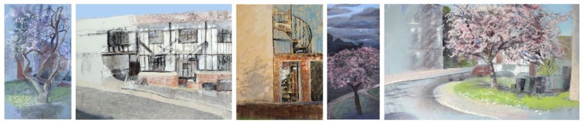
1 Well, except for these visions of loveliness:

2 In order to view my work flat and escape skewing the image (well, that’s the theory…)

3 Personally I don’t believe they exist.

4 I should really get that Tablet.

5 I knew my climbing harness would come in handy…

6 It’s hard for me to justify buying them, since I mostly use pastels… though this creates a bit of a feedback loop since it’s also one of the reasons I prefer using pastels. I mean, good soft pastels aren’t cheap, but if you break one it doesn’t mean £30 down the drain. Also, it is definitely getting harder to a) find art shops in which you can actually handle your brush before purchase and b) within those few shops, find a good undamaged selection of brushes (probably due to all that brush-handling). Yeah, I’m looking at you, the (brushes aside) wonderful Berkhamsted Arts and Crafts.

7 Other pet cleaning hates include (but are not limited to) anything which has had Dammar varnish on it, paint pots, my desk, my floor, my paint palettes, (OK, I mean the Ferrero Roche plastic box which I use as a paint palette, but it’s still annoying, although at least if means if I really do decide the palette has given up the ghost I can then go out and buy a huge tray of Ferrero Roche for my new palette. One must make sacrifices for one’s art).

8 For those who are interested, Turpenoid is more environmentally friendly, less smelly, and easier to deal with than traditional turpentine – I believe you can just wash it down your sink – but, it is really a solvent to make oil paint soluble in water, not a medium per se, so adding more than a touch to your oils (I think the maximum ratio of Turpenoid to oil paint is 1:3) may cause them not dry and even start removing pigment from your image when you apply the brush!

9 In fact, someone somewhere (the internet) suggested to me that, when you work on painting oils over a dry layer underneath, you should first thoroughly cover every nook and cranny of your board with linseed oil, and then (just as thoroughly) wipe off all but a hint of it with a makeup sponge. This is supposed to allow your brush to glide over your surface smoothly, while not causing beading of the paint due to excess linseed oil. Because beading is a right pain in the patella.

10 Honourable mentions also go to social media and the internet, for being… difficult.

11 I should really learn to work without a formal deadline…

Workshopping weekend

First things first… many thanks to all the people in the workshop who kindly let me use images of their artwork in the image banner above! (Including the couple actually from a completely different workshop, but I think would look really awesome done in this technique ^_o). There are a couple of images still pending which I hope to add in as they arrive…

Ahem. So. Recently1 I attended a workshop by Jan Munro – whose vibrant watercolour and pastel artwork I strongly recommend you look at – on painting urban scenes using gouache resist.  Now… urban scenes are not my favourite subject, ranking somewhere below cars and other machinery and just narrowly beating studies of plants with endless foliage.

But.

I’m a huge fan of Jan’s workshops, and intrigued by water-resist techniques in general2, so I jumped in3.

The technique – which Jan had learned about from a book by Moira Huntly4 – involves very carefully planning a black-and-white image; transferring it to watercolour paper; painting white gouache over all the white areas and, when dry, coating the entire page with non-water-soluble coloured ink (usually acrylic or Indian). When the ink is dry, the picture is, nerve-rackingly, immersed in water and gently scrubbed to remove the ever-soluble gouache (and by extension all the ink on top of it5), revealing a dramatic monochrome print-like image… however, I will leave the full details of the technique to Moira Huntly6.

As ever in a workshop with lots of people, I was particularly taken with all the variations on this one technique everyone came up with. And – since my natural anal-retentive tendencies meant I finished three days after everyone else – I tried to incorporate some of their findings into my own painting…

FIN colour smallest - squared AND LABELLED


1By which I mean over a month ago. I’m suffering from severe postlag.

2I sense some pointed looks at the almost complete lack of water-resist images in my gallery. I’m intrigued… just bad at using them.

3Not literally. That would have made a real mess of the gouache.

4Entitled ‘Learn to Paint Mixed Media’… I think. Please correct me if wrong!

5Though while the gouache remains soluble, the ink becomes increasingly hard to remove over time, so leaving the ink layer to dry overnight is not advised.

… But I just couldn’t resist dumping a load of boring general tips at the end anyway:

  • Rough paper gives a ‘grainier’ effect.
  • The gouache consistency is usually somewhere between double and single cream (assuming you want mostly opaque white areas; it can be lightly thinned with water for less opacity).
  • You can in theory tint the white gouache (or use coloured gouache) to make it easier to see on the page, but isn’t advised since any tint or gouache containing any sort of staining pigment will mar the white areas. Instead, you can hold the picture up so that light shines through the paper to see where the white gouache has been applied – and how thickly.
  • Test the ink is totally insoluble – even if it says it’s insoluble – before you put it over the gouache. Oh my yes. Or – as one attendee found to their cost – the whole detailed image you’ve just spent ages on will lift off, rather than just the white bits >_<…
  • At the other extreme, leaving the ink on overnight makes it very hard to remove, gouache underneath or not, so not recommended.
  • Applying the ink must be done very gently with a large, soft brush, fully loaded with dilute ink (maybe a third to a half water vs. two-thirds to a half pure ink depending on ink pigment strength, to improve the coverage). One stroke only to cover the whole length of your image is best, since even the lightest brushing over the gouache with ink will start to remove it.
  • If you don’t have a big enough receptacle to immerse your paper in, holding it under a running tap and gently scrubbing with a standard washing up sponge scourer usually works to remove the gouache.

Harpenden Arts Club Exhibition

Well, I was midway through drafting a post on a very interesting gouache resist workshop (I’m still working on it… only three weeks late so far), but instead of I will say…

… YIPPEE ~^^~!

One of the pictures I entered into the Harpenden Arts Club exhibition won the most popular vote-from-the-general-public. It was another Cedar-the-eagle-owl pastel (I honestly do draw things other than owls occasionally), and since I thought the standard of work in the exhibition was very good, I was most flattered ^^.

Also to my great joy I managed to sell two of the three works that I entered, which is a relief to the walls of my house against which all the leftovers are stacking up. It was probably even more a relief to the kind friends who first visited the exhibition and then lugged my single remaining (but enormous) picture home in their car1.

Anyway, since I completely failed to take any photos of my pictures after I got them framed, I have pasted a lovely eframe mockup at the top of this post instead which is why all the images have little close symbols in the top left corner. NB mockup may be less lovely than claimed.


1 I should also take this moment to thank the fellow artists and artist-affiliates who helped me transport all my pictures to the exhibition in the face of extremely heavy traffic, and even heavier queues @___@.